





 Feed
Feed Scan with QR Code Reader
 mobi
mobi- Advertise / Donate
Welcome !
Newquay weather receives over 1000 vistors per day winter time, rising to over 3000 to 4000 or more in the summer, including visitors from all over the world.
Please help support this site

Your business

Via Paypal
- Accommodation
Hotels, B&B's and Caravan and Camping Sites

Porth Sands - Luxury beach accommodation wth beach facing balconies, a golden sandy beach making it the perfect place to idle away the hours- swimming, body boarding, sunbathing and paddling.
- Food
Restaurants, Cafe's, Takeaways

Pachanga - Pachanga Authentic Mexican Since 2016 we've been re-creating dishes that are part of our cultural heritage using techniques that are unique to Mexico. We use mostly Mexican, local & organic produce in our dishes & drinks
- Charity Events
Charity Events - Max 3 free ads
For a Free Charity Ad Here, please contact me- - Houses for Sale
Houses for Sale
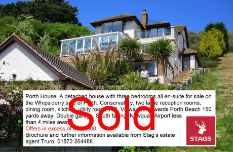
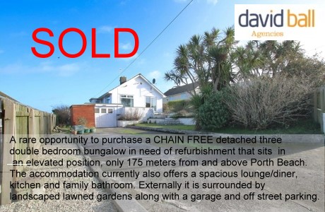
Advertise your house for sale here and help support this site.
Small photo, text + link to agents for a One off ₤25. Please contact me.Advertise your house for sale here
- Local Services
Shops, Services etc

Towan Insurance BrokersCornwall's local commercial insurance specialist. We help Cornish businesses find the right cover, from tradespeople and property owners to specialist contractors. Based in Cornwall, independent, and genuinely invested in the businesses we work with. Visit us at Towan Insurance Brokers
Climate Warming Stripe - graphics
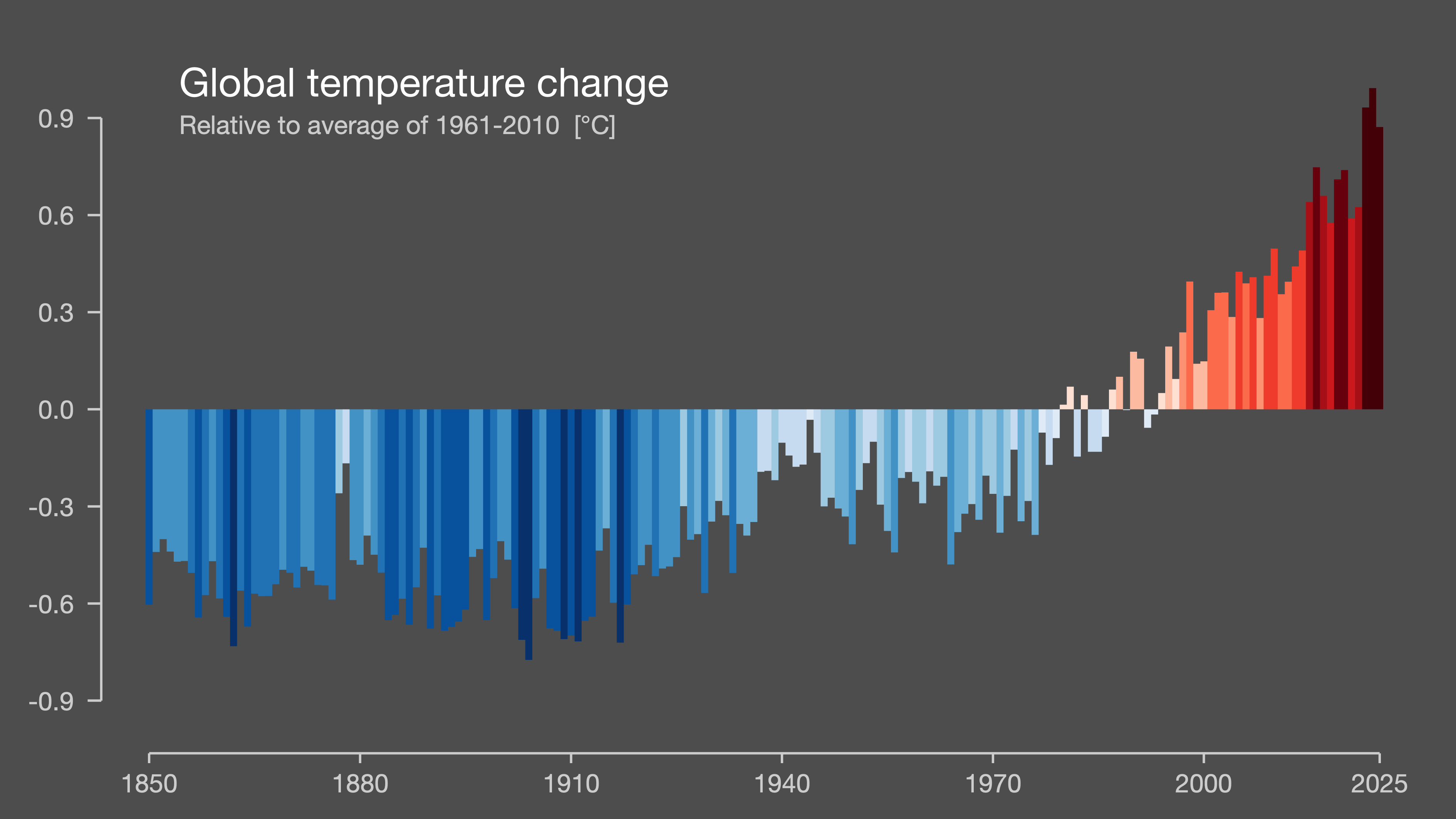
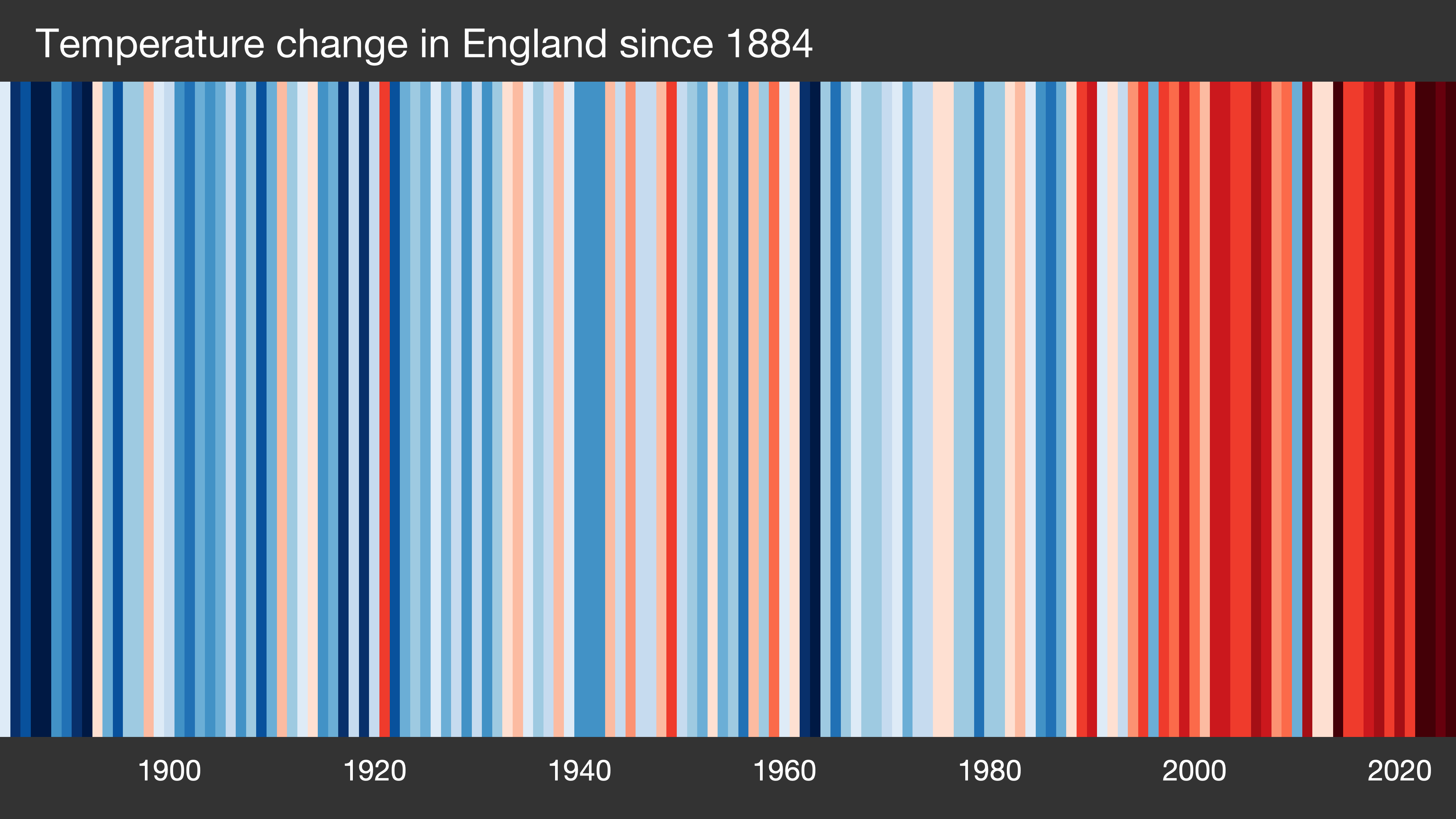
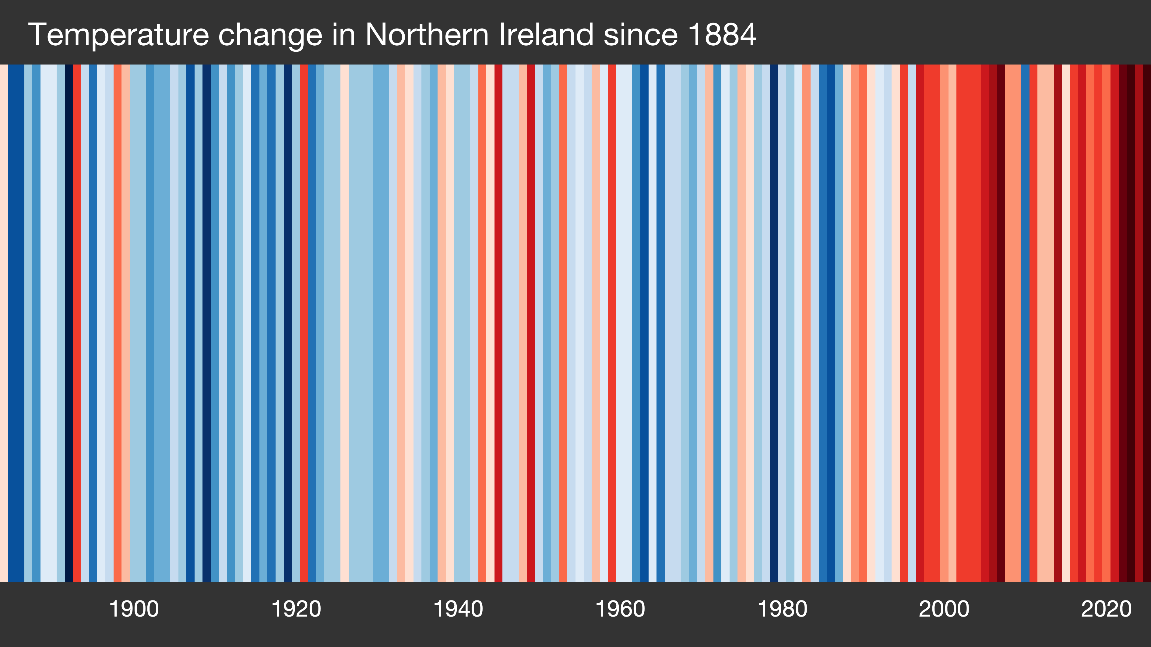
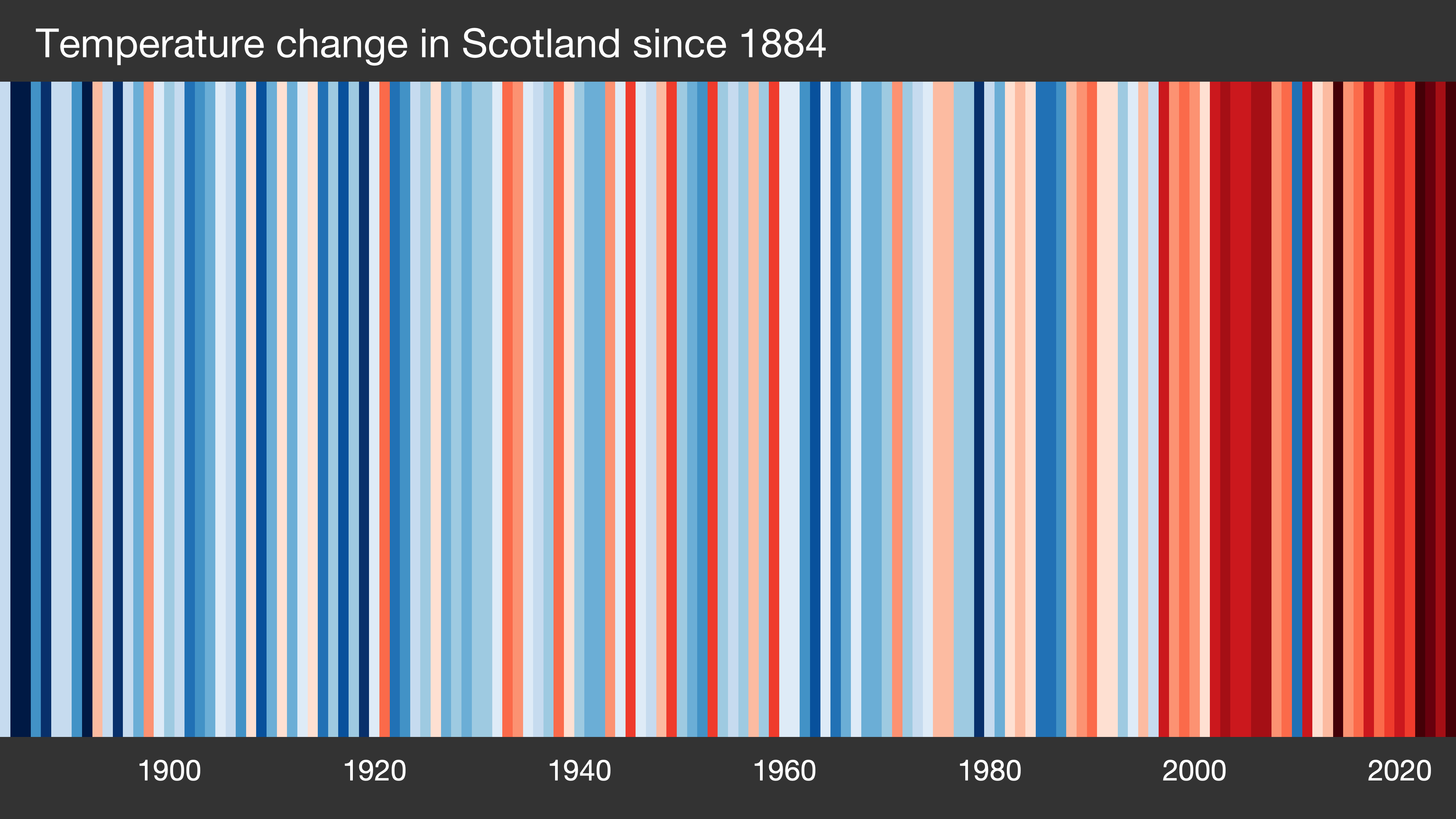
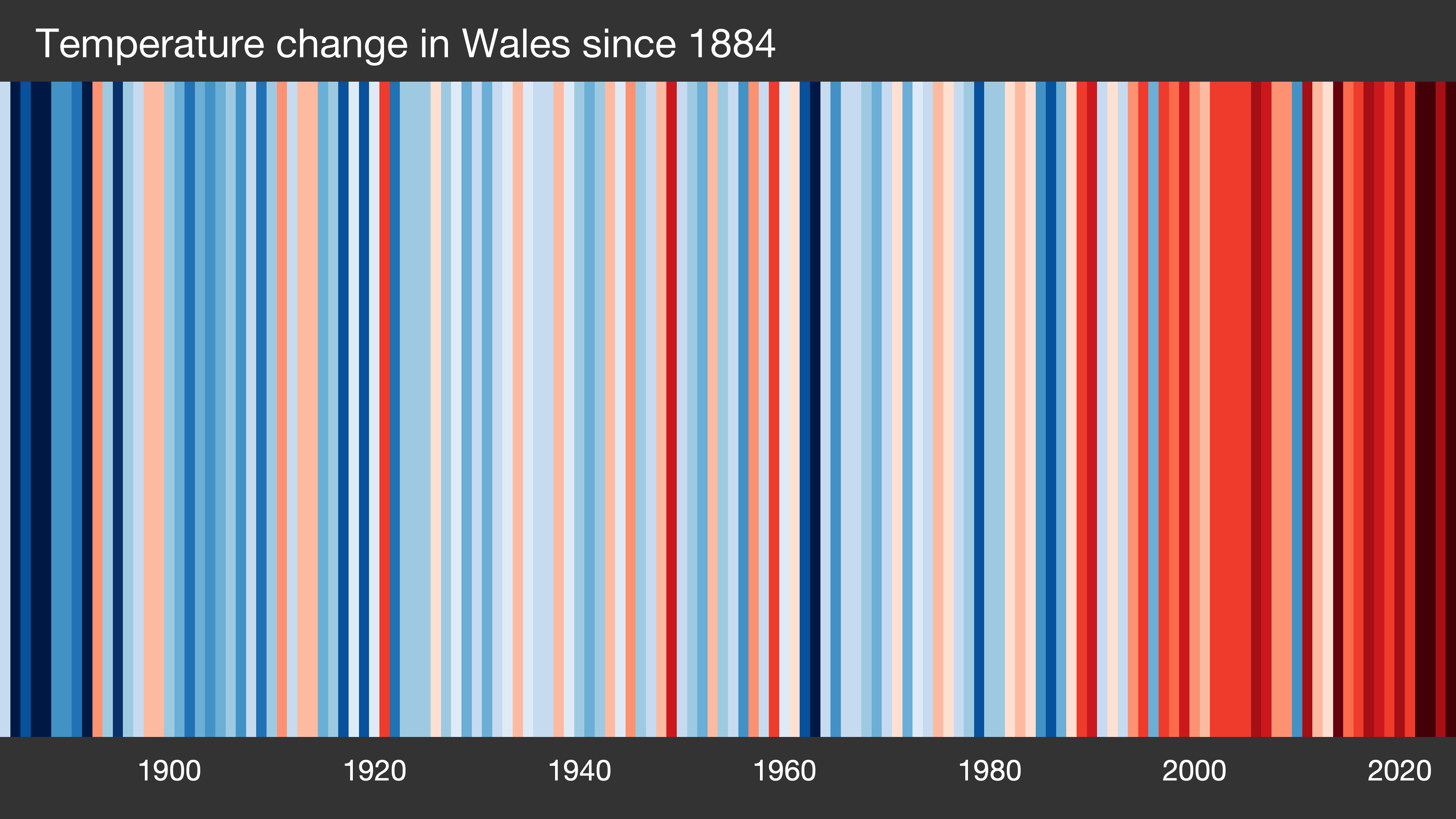
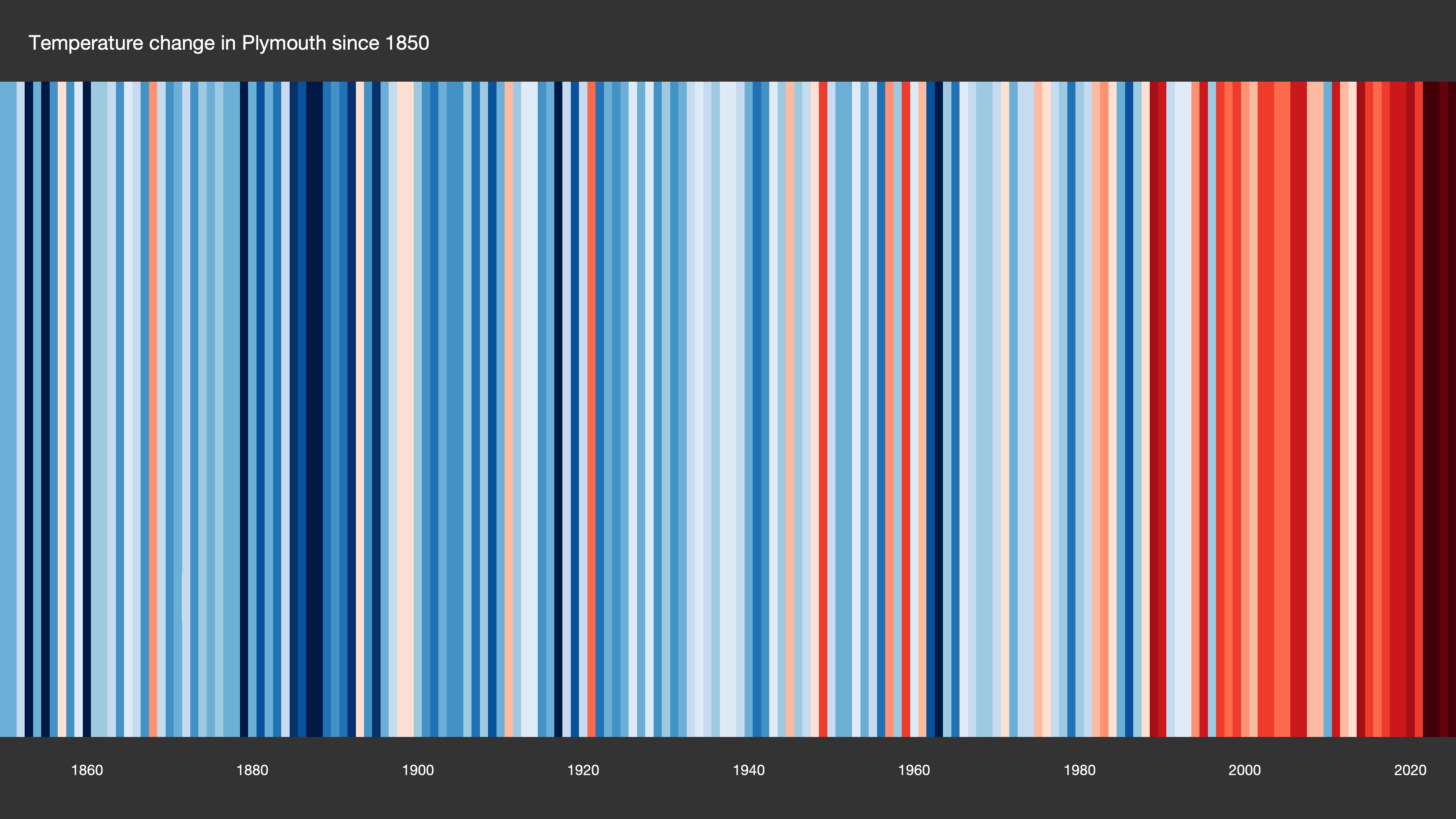
Warming stripes (sometimes referred to as climate stripes, climate timelines or stripe graphics) are data visualization graphics that use a series of coloured stripes chronologically ordered to visually portray long-term temperature trends. Warming stripes reflect a "minimalist" style, conceived to use colour alone to intuitively convey global warming trends to non-scientists while avoiding technical distractions.
These warming stripe graphics are visual representations of the change in temperature as measured in each country over the past 100+ years. Each stripe represents the temperature in that country averaged over a year. For most countries, the stripes start in the year 1901 and finish in 2018. For the UK, USA, Switzerland & Germany, the data starts in the late 19th century.
To check out other countries see Showyourstripes
GLOBE from 1850-2025
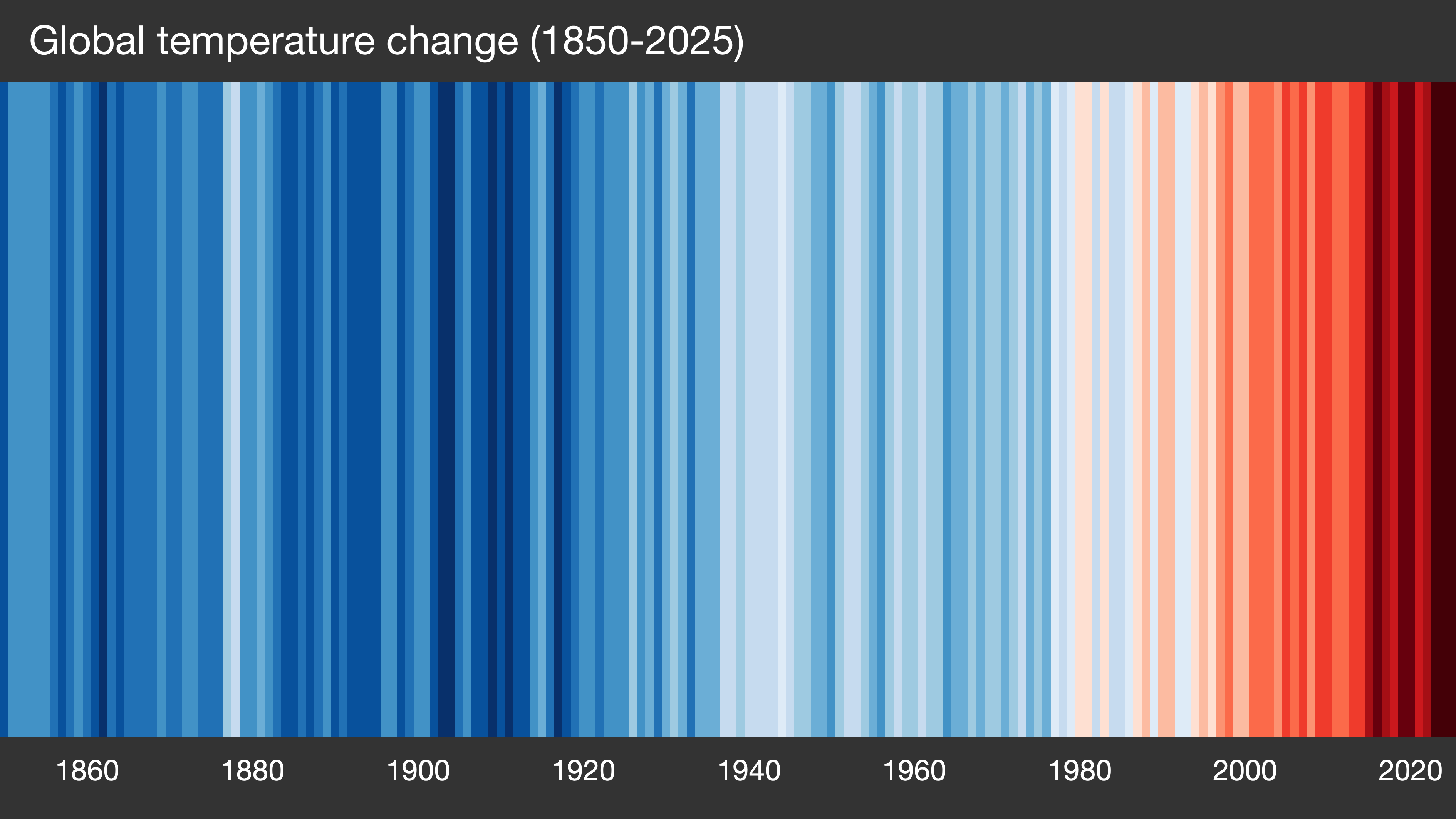
GLOBE from 1850-2025 Bar Chart
United Kingdom from 1884-2025

England from 1884-2025
Northern Ireland from 1884-2025
Scotland from 1884-2025
Wales from 1884-2025
Plymouth from 1814-2025
Plymouth from 1814-2025 Bar Chart
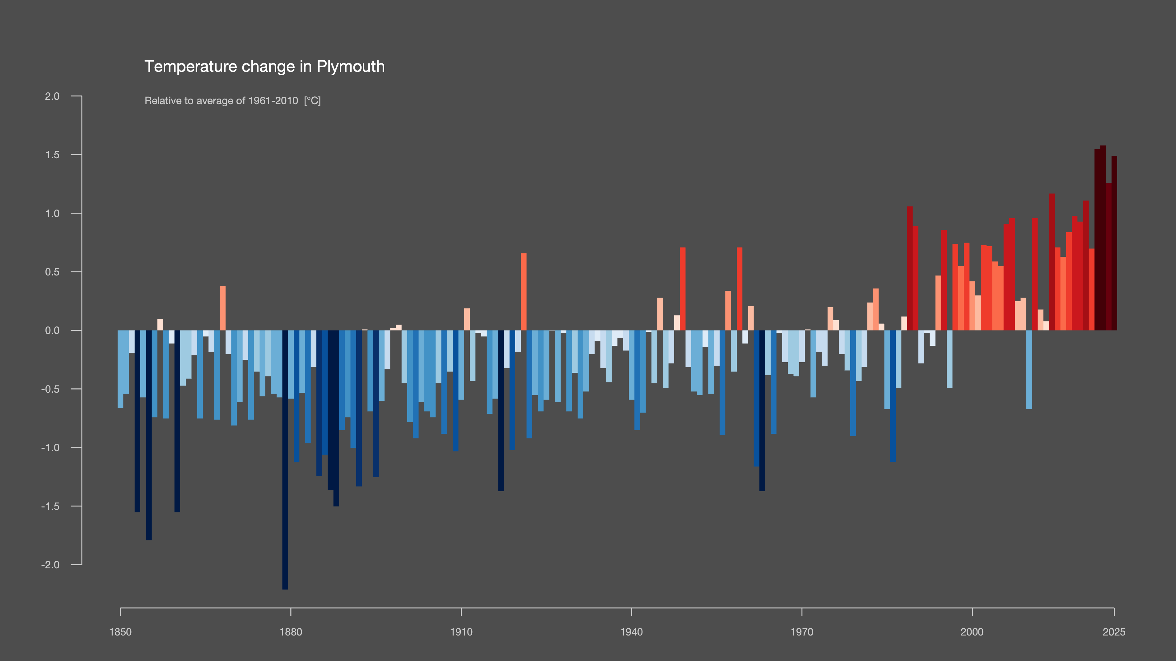
Data Courtesy of Professor Ed Hawkins (University of Reading) Showyourstripes
Page Updated 6th August 2026